

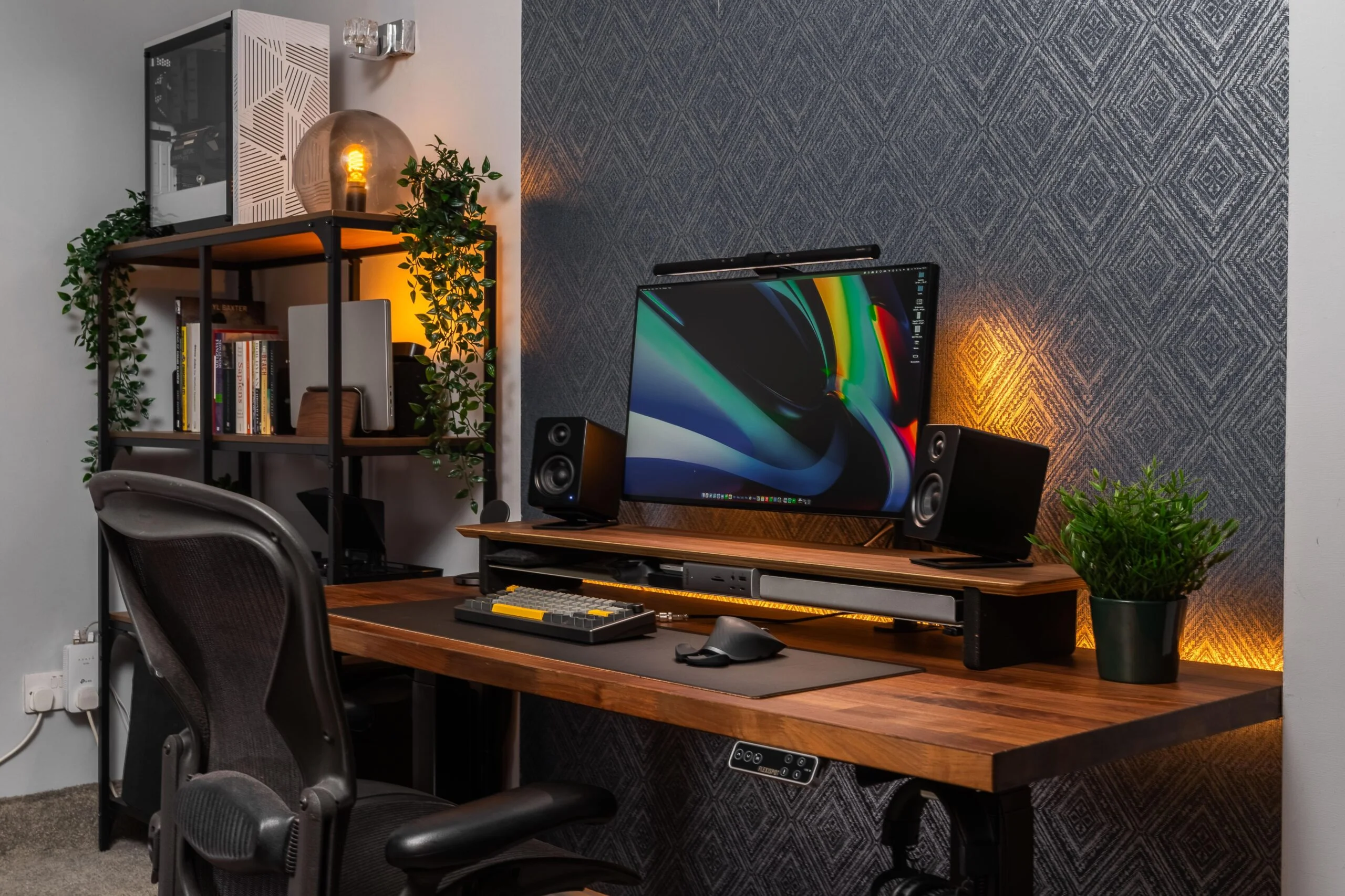
There’s a particular kind of desk setup that photographs beautifully and is quietly miserable to work at. Everything is aligned, the cables are invisible, the plant is exactly where it should be — and after three hours you’ve got a stiff neck, nowhere to put a notebook, and a drawer you can’t open because the chair is in the way.
The photo was designed. The workspace wasn’t. Getting that right takes some thought before the furniture arrives, not after.
Stage 1: Start with the work, not the desk
Most setup planning starts backwards, with a desk someone saw online. It works better starting with a question: what actually happens here, every day?
A writer needs surface area and very little else. A developer running three monitors needs depth for viewing distance and a desk wide enough that the outer screens aren’t at an angle. A 3D artist wants a tablet zone and somewhere for reference material.
A photographer or video editor needs drives, cards, and card readers within reach, plus somewhere to put a camera down safely.
Anyone on calls all day is thinking about what’s behind them and where the light falls on their face. Makers need surface that can take a knock.
Then the format questions. Sitting, standing, or both? Is this deep focus work, or constantly interrupted? Does the desk need to switch between modes — coding in the morning, sketching in the afternoon?
The answers determine the desk depth, the storage, and the lighting far more usefully than any inspiration photo will.
Stage 2: Map the reach zone
Forget layout as an abstract idea for a moment and think in terms of distance from your hands.
Three zones, roughly. The primary zone is everything you touch constantly — keyboard, mouse, tablet, a mug, a notebook if you write while you work, headphones if you switch them on and off. This should be genuinely uncluttered, because anything here that isn’t earning its place is costing you space.
The secondary zone is within a lean or a swivel: reference books, a drive you access daily, a pen pot, charging cables. Shelf or drawer territory.
The third zone is everything else — the gear you use weekly, spare cables, packaging, backup drives. This should not be on the desk. It’s the most common failure in home offices: things migrate to the surface and never leave.
Be honest about the middle category especially. Most people overestimate what needs to be within arm’s reach and end up with a desk that’s full before they’ve started working.
Stage 3: Test the furniture before the room gets crowded
This is where things go wrong expensively, because furniture scale is deceptive and rooms are smaller than they feel.
The measurements that matter: desk width and depth against the wall you’ve got. Chair clearance behind you — enough to push back and stand without hitting anything. Monitor distance, which needs roughly an arm’s length and is why a shallow desk fights a large screen.
Shelf depth, since deep shelves above a desk make the space feel like it’s leaning over you. Storage height, so drawers actually open with the chair in position.
And any wall-mounted arm, pegboard, or acoustic panel, which needs planning around where you’ll be sitting.
For desk, chair, shelving, storage, lighting, and home-office furniture brands, 3D furniture visualization can show products inside realistic workspace scenes, helping people understand scale, material, layout, and how each piece supports the way the room is actually used.
Whether you’re using those images while shopping or sketching your own plan, the point is the same: see the pieces together, in the room, before anything is bought or built. Masking tape on the floor works too.
Stage 4: Design for light, not just aesthetics
Light is a furniture decision, though it rarely gets treated as one.
Start with the window. A screen directly facing a window means glare; a window directly behind you means silhouettes on video calls.
Perpendicular to the window is usually the compromise that works. Then think about what the room does at different hours — a setup that’s perfect at 10am can be unusable at 4pm.
Furniture colour matters more than people expect here. In a room that doesn’t get much daylight, a white or light wood desk bounces what light there is around and keeps the space workable.
A dark walnut desk looks superb in photographs and can make a dim room feel like a cave. Matte surfaces are kinder than glossy ones, which throw reflections onto screens.
Then add task lighting for the evening, and something soft behind you if you’re on camera regularly. A single overhead light is almost always the wrong answer.
Stage 5: Choose furniture that supports posture and movement
Most desk pain doesn’t come from cheap furniture. It comes from correct furniture set at the wrong heights.
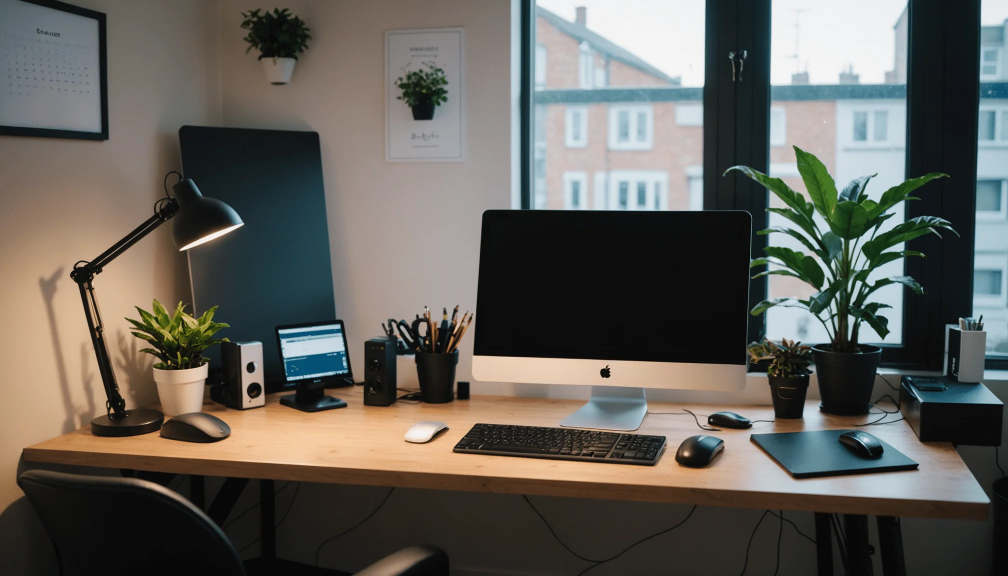
The basics are worth getting right before spending anything. Chair height so your feet are flat and your thighs roughly parallel to the floor. Desk height so your forearms are level when typing — this is where a lot of standard desks fail taller people.
Monitor top at about eye level, which usually means a stand or an arm, since almost no monitor ships at the right height. Keyboard and mouse close enough that your elbows stay near your sides rather than reaching forward.
Fix those and an inexpensive chair often outperforms an expensive one that’s been adjusted badly. If you’re considering sit/stand, be realistic about whether you’ll actually use it — plenty of standing desks spend their entire lives at sitting height.
Stage 6: Add personality last, but don’t skip it
A setup that’s purely functional feels like a workstation in an office you don’t like. The personal layer is what makes it somewhere you want to sit down.
Prints or art on the wall behind or beside you. A shelf with books you actually read. A plant or two, which do genuinely improve a room.
Speakers if sound matters to you. Objects with some history — a camera, a tool, something you made. A colour accent that isn’t grey.
The only rule is that it shouldn’t fight the work. Keep the primary zone clear, put the personality in the peripheral vision and on the walls, and the setup reads as yours without becoming an obstacle course.
Stage 7: Run the one-week test
Here’s the part nobody does. Work in the finished setup for a week, properly, and pay attention.
Note what you move every single day — that thing is in the wrong place. Note what you keep bumping into or reaching around.
Watch where cables gather, because they always gather somewhere. Check whether the chair is still comfortable at hour three, not hour one. See how the light behaves in the morning versus late afternoon. Notice whether you ever run out of surface.
Identify the item that looks great and hasn’t been touched all week. And notice what you keep getting up to fetch, because that belongs in the reach zone.
Then adjust. A setup is rarely right on the first arrangement, and the week of real use tells you far more than any amount of planning.
Final thought
The best maker stations aren’t the untouched ones. They’re the ones where every decision — the desk depth, the shelf height, the angle to the window, the chair — was made around the work that happens there.
When it’s right, the furniture stops being something you notice and becomes something you stop noticing, which is exactly what you want at eight in the morning with something difficult to start.
